

BRAND DESIGN: CASE STUDIES
A series of case studies highlighting comprehensive and holistic brand design and strategy clients through the application of print, packaging, social media graphic design, web and product design.
no. 1
no. 1
rebrand: L’ESTATE
L’estate is a boutique curator-run vintage shop primarily operating through e-commerce and engaged weekly social product drops. Along with the vintage products, visionary Tracy Chab offers home and business interior styling on a consultant basis as well as commercial consultations including sourcing for influencer Danielle Bernstein of Who What Wear and the most recent season of Queer Eye, working alongside Jeremiah Brent of HGTV.
BRAND DEVELOPMENT: NAME TO LOGO TO WEBSITE
The project took place over a 10 week structured period, progressing through the design process with weekly reviews and revisions to naming, copywriting, logo design, website functionality and implementation.
Smart Warehouse Retrofit
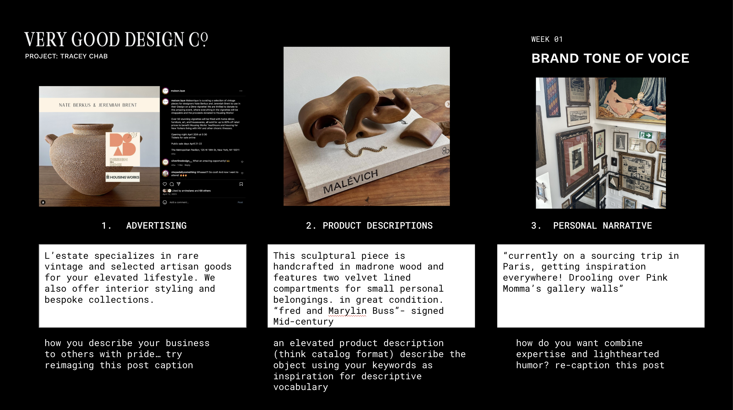
Sample of Client Working Deck
Project Scope
-
The first step in the process for the client was rebranding through naming. We explored inspirations for the business and Tracey’s design background to find inspiration for her curation’s voice.
-
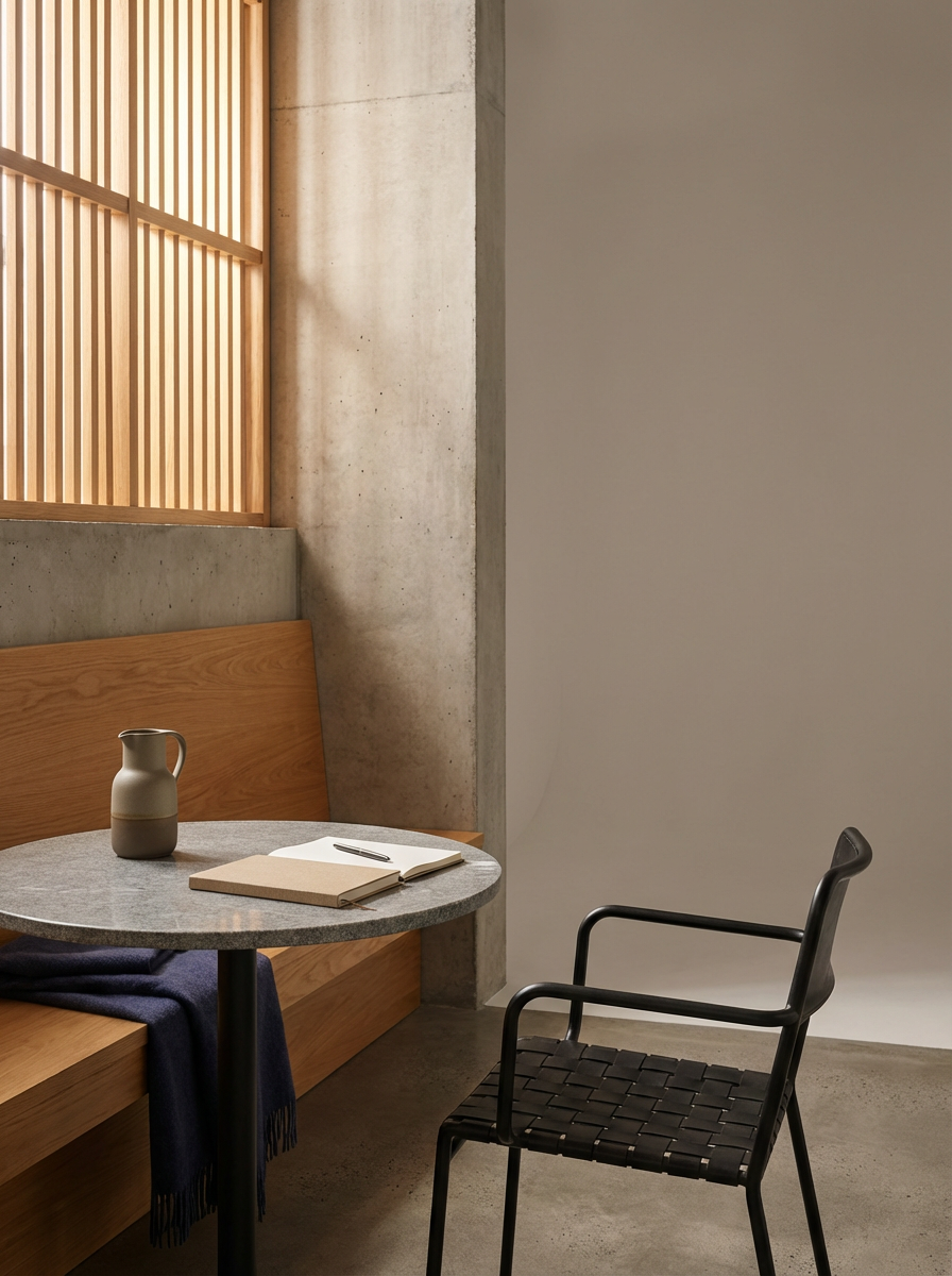
Next, we tackled the visual brand with a new logo, colors and a photo inspiration guide as a component to the overall ‘brand bible’ / a document created for each client with guidelines and instructions for a cohesive use of brand assets moving. forward.
-
After the final logo was decided on, we embarked on the process of curating type options to support website and brand buildout.
-
Handwriting samples, favicons, user experience and operations management
-
With a solid visual brand foundation, we next tackled a functional e-commerce website and strategized not only look and feel, but sustainable functionality as well. This functionality included best practices and a strong SOP for sales, holds, photography, weekly drops and shipping logistics.
NEW NAME, NEW LOGO
Formerly Maisonique, L’estate grew from a solid foundation into a stylish, niche outlet for high end, rare vintage and art. The update reflects deeply on the curators art history background, elevating relics for your modern home. The brand’s identity features a sleek, san serif block type accompanied by the curator’s own handwriting. This style adds a sense of personality and intimacy through nostalgic connection.



Tracey’s handwriting was digitized for the logo and various titles throughout the website
the visual journal:
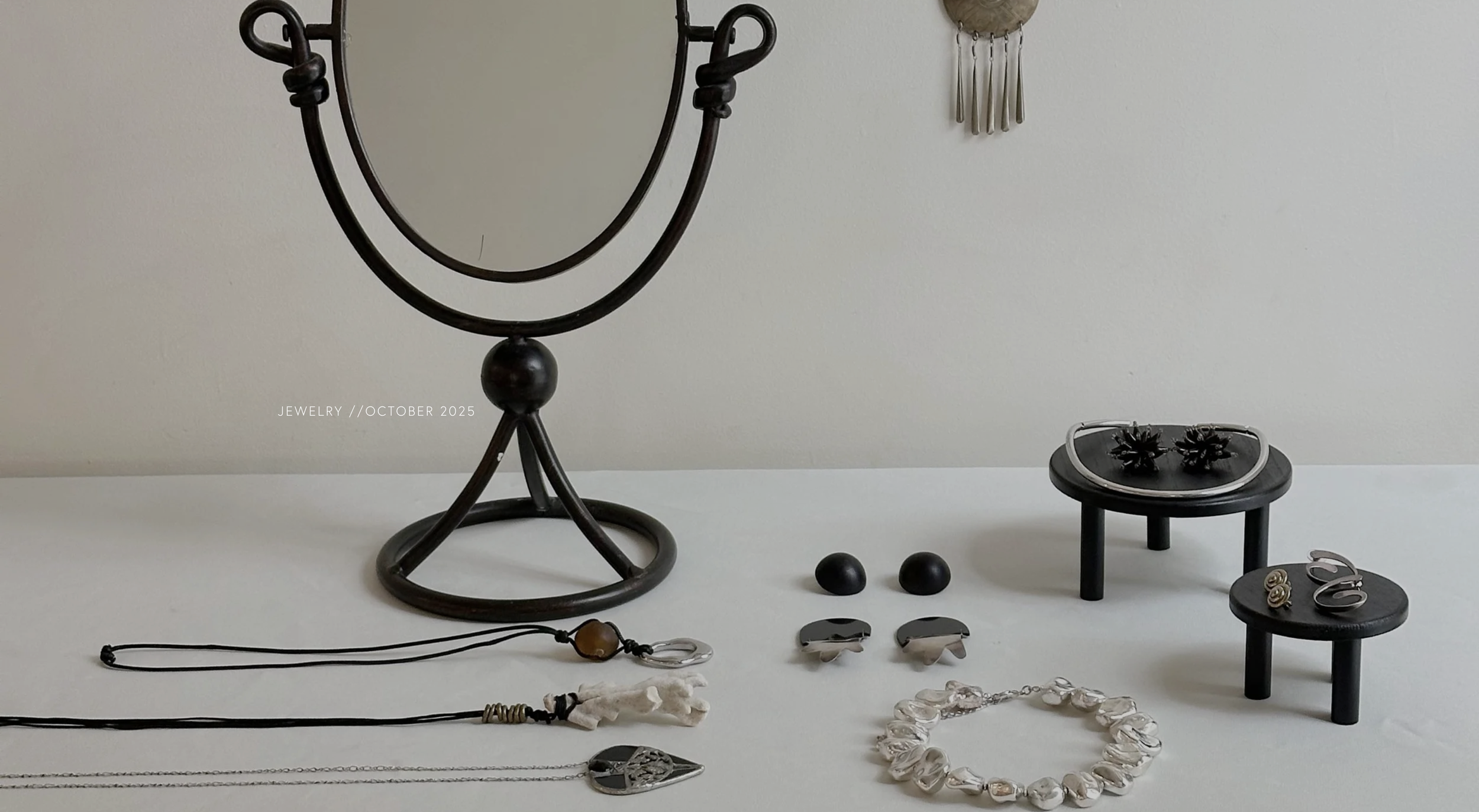
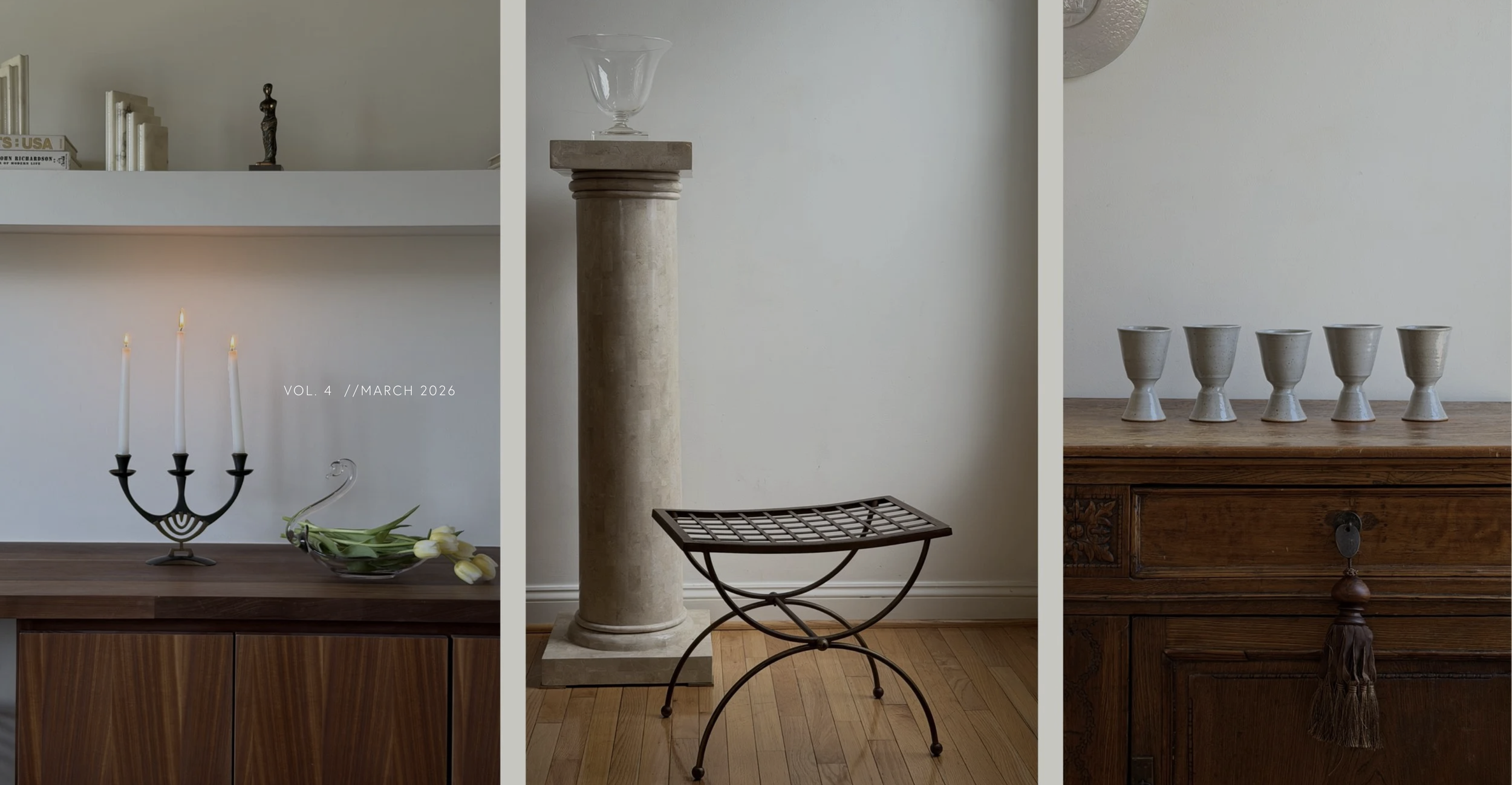
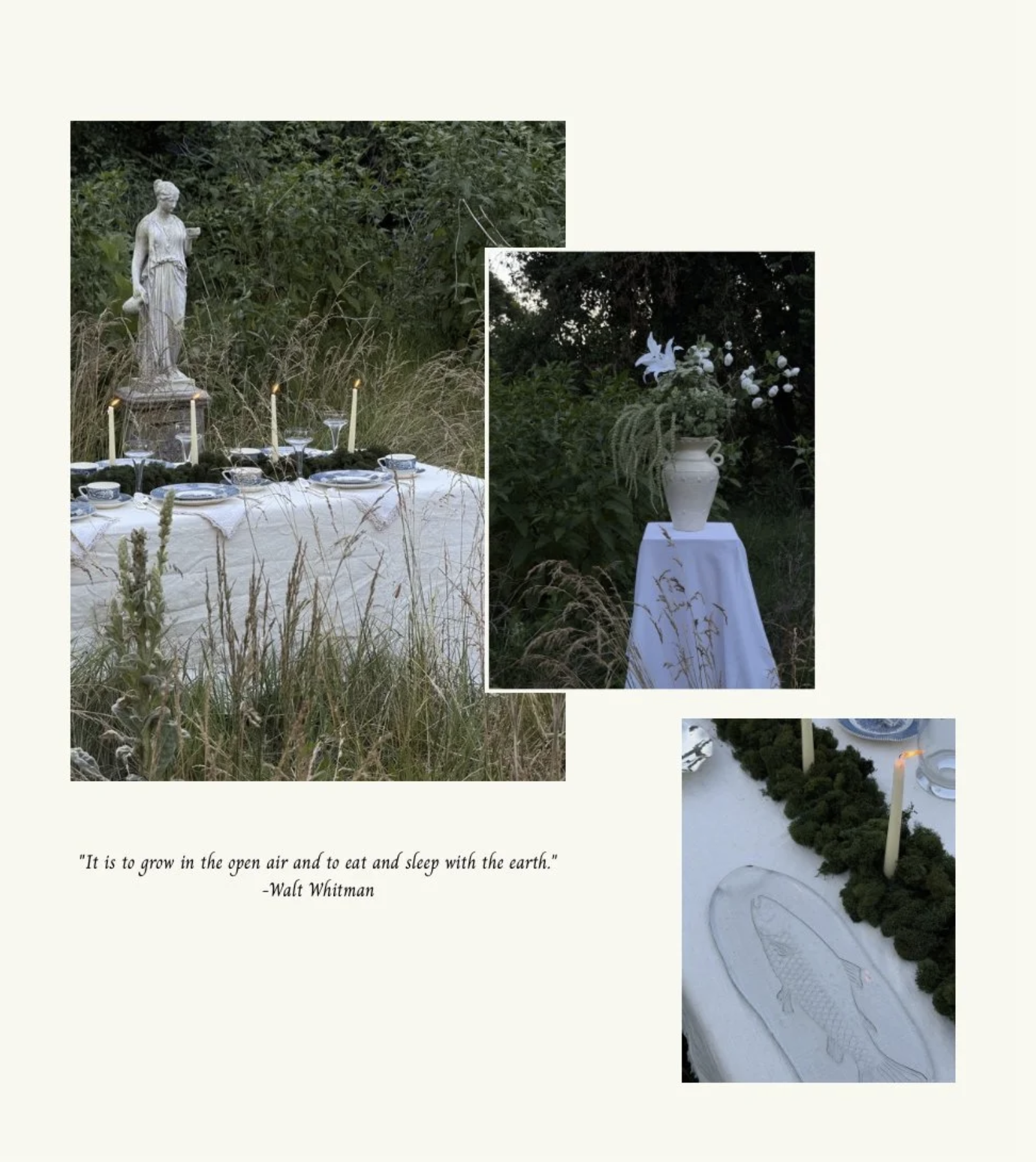
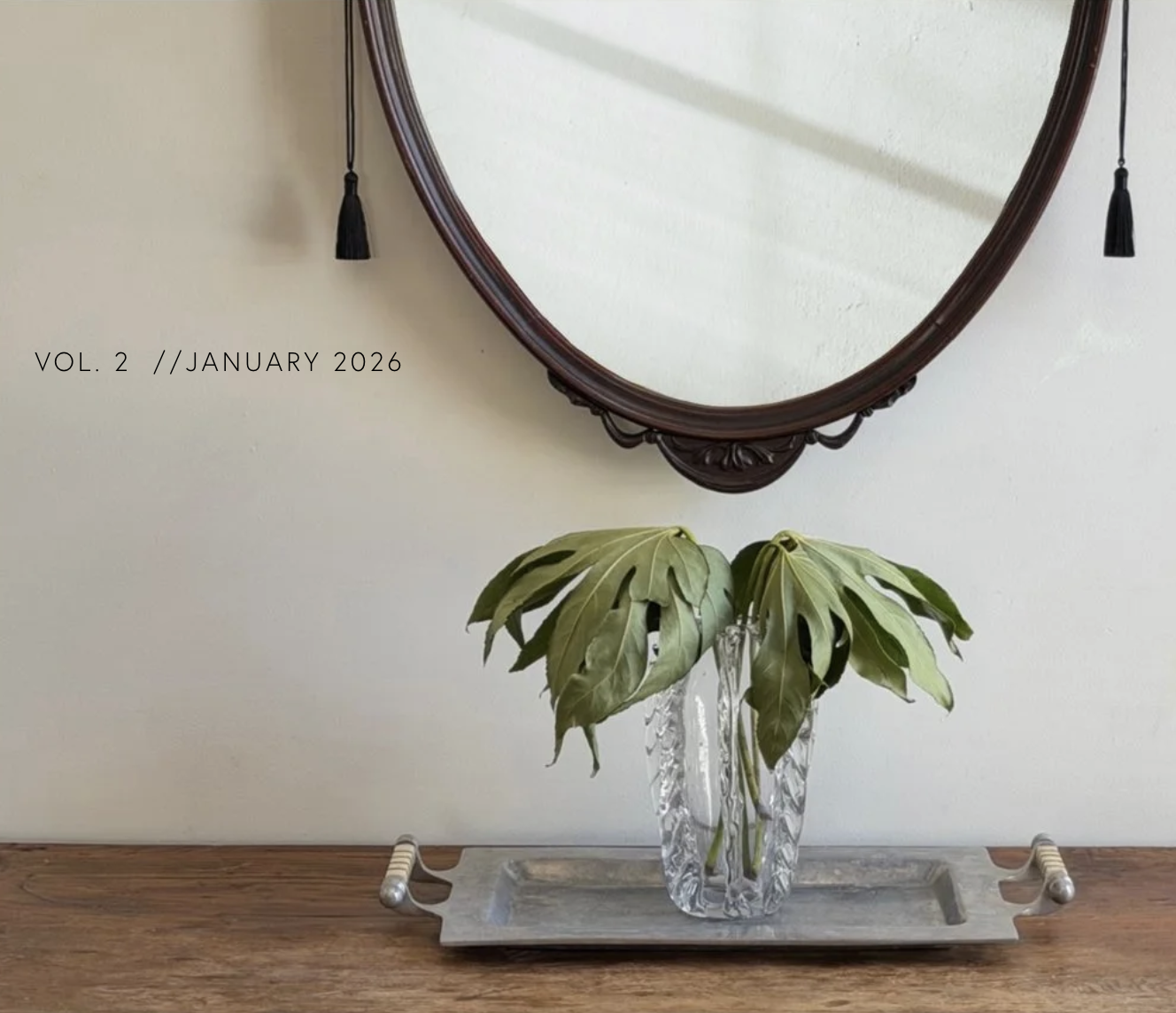
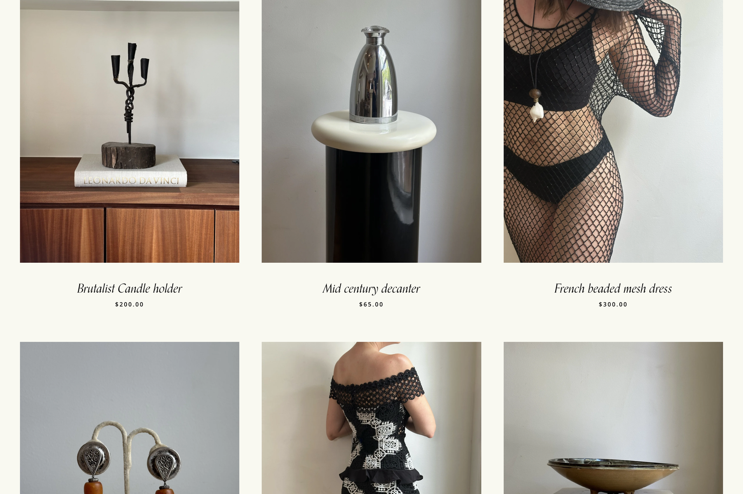
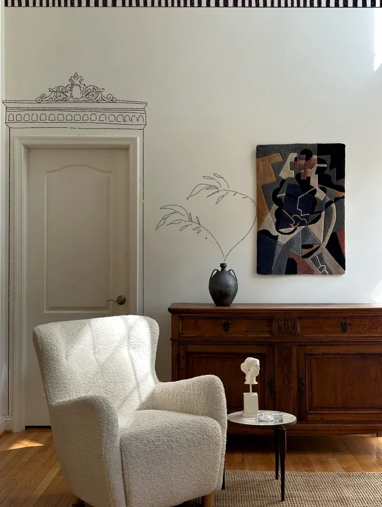
To create a unique shopping experience - the collection page was implemented as a parallel to a campaign style release, working into two imagery styles: ecomm and collection. The curator shoots clear images of the products in a styled but clean environment, along with detail shots, fully styled images of the collection grace the homepage of the site and are used for social media promotion and drop reminders.
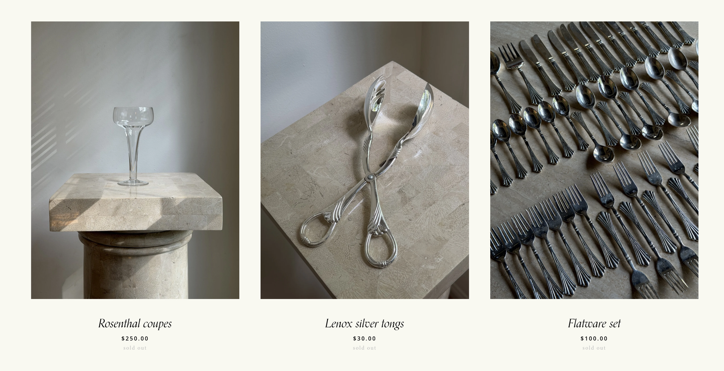
E-commerce through visual storytelling
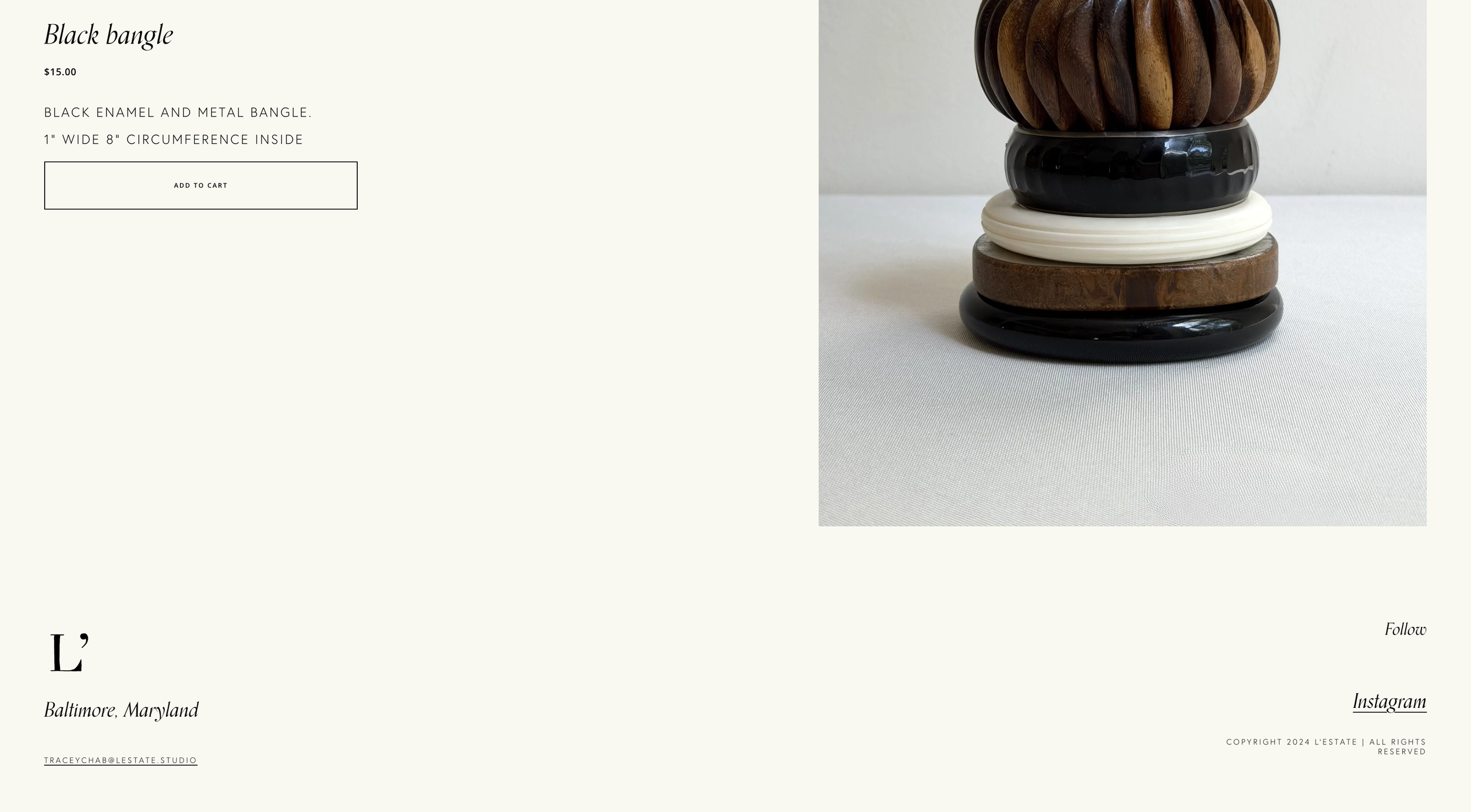
The visual journal is accompanied by a traditional e-commerce shop grid. Drenched in the rich, refined eye of Tracey Chab - the products come to life through her unique photography and styling creative hand.
results
15+
+ 3,500
followers on instagram in the first 3 months after new site launch
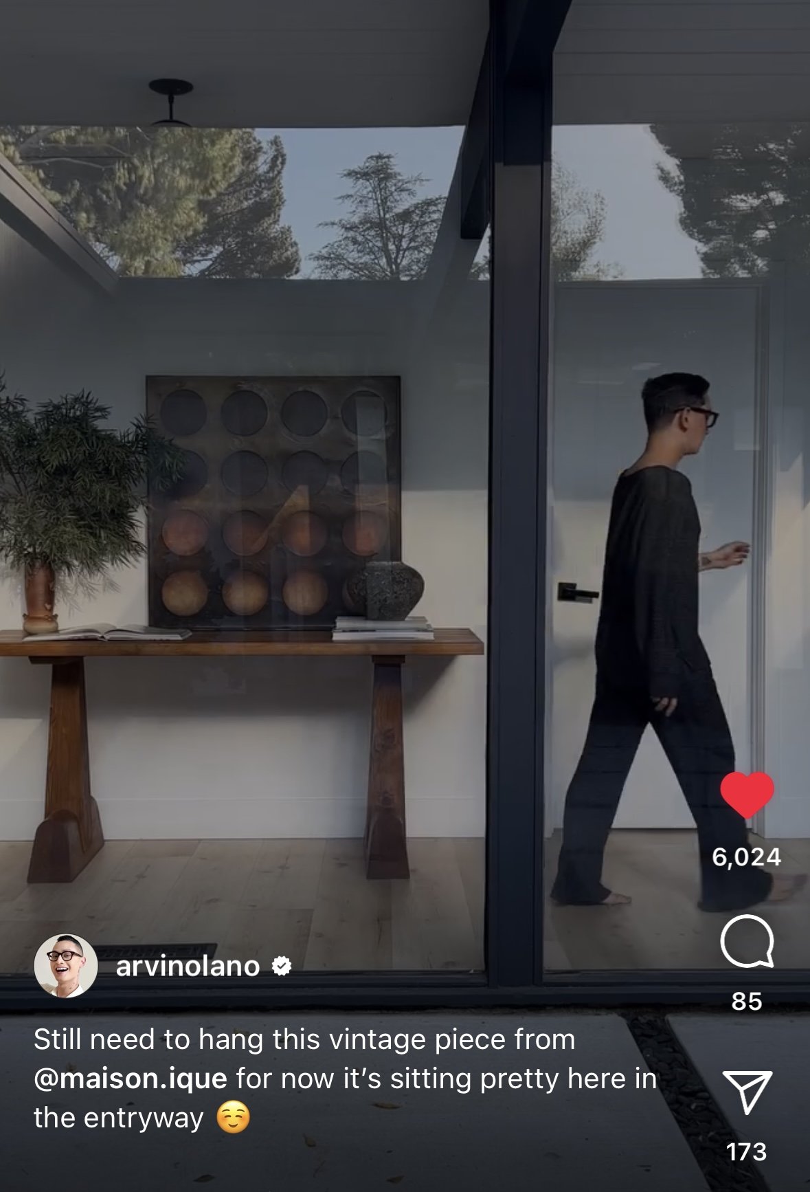
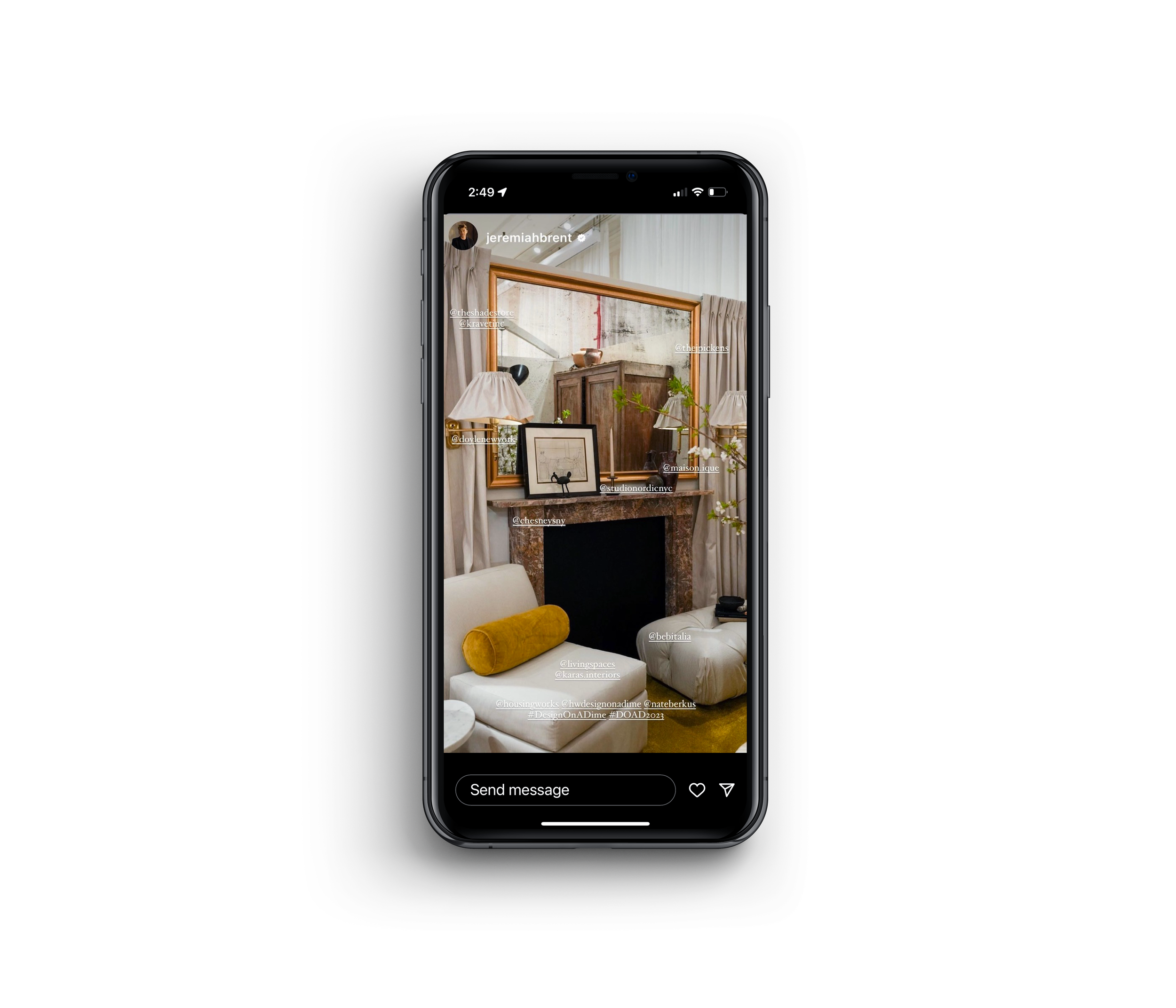
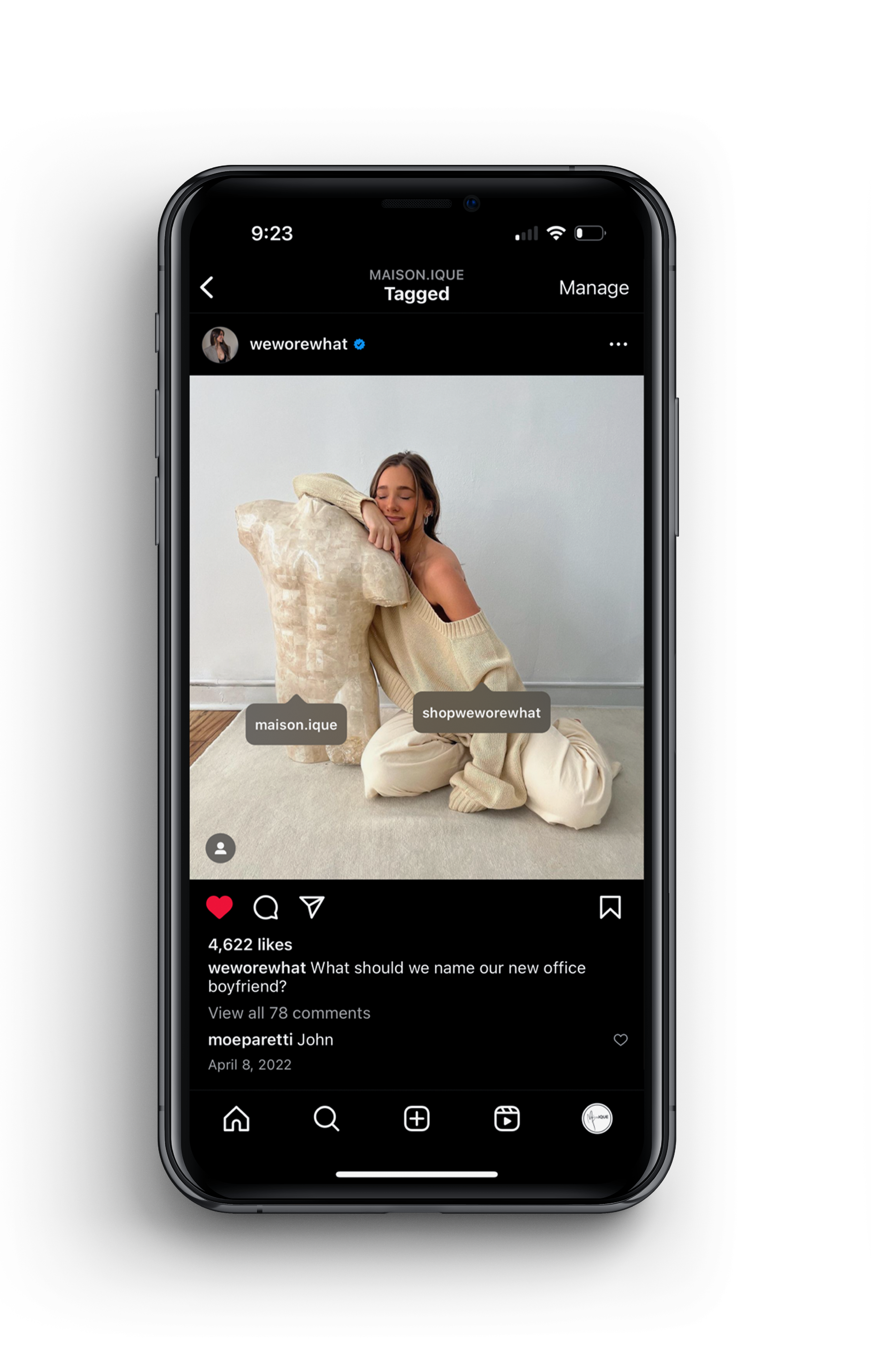
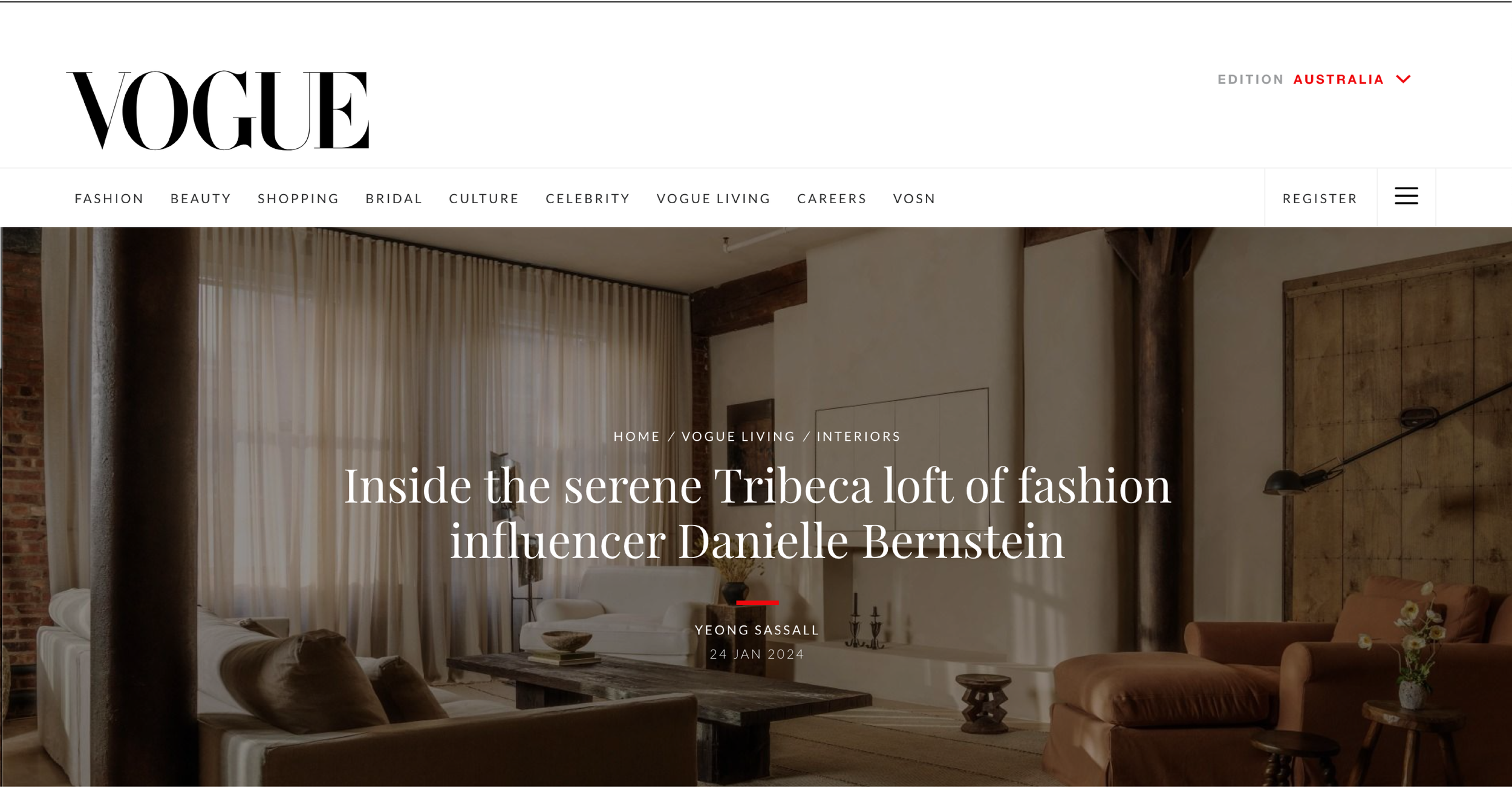
high profile partnerships and new client relationships including Vogue, HGTV, Nate Berkus & Jeremiah Brent, Arvin Olano and Danielle Bernstein.